Learn how to add a comment section in Docusaurus using commentbox.io

In this article, I will show you step by step how to add a comments section in your Docusaurus blog using commentbox.io.
Prerequisites
Set up commentbox.io account
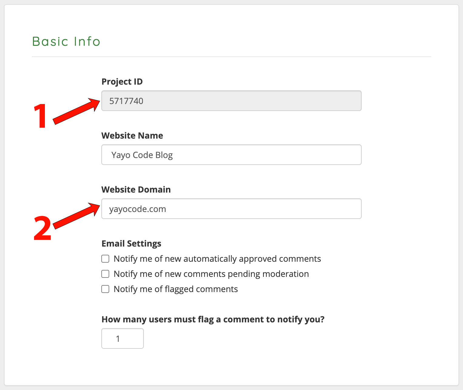
Visit https://dashboard.commentbox.io to get your project ID.
- Copy your project ID, we will use it later to initialize commentbox.io in our Docusaurus project.
- During development, type
localhostin the Website Domain field. When you release to production make sure the Website Domain matches your own domain, for example, in my caseyayocode.com.
Install the commentbox.io package from NPM:
Use the following command to install the commentbox.io package from NPM:
npm install --save commentbox.io
Swizzling
We will use swizzling to add the comments section to our blog and documents. But what is swizzling?. According to the Docusaurus documentation:
In practice, swizzling permits to swap a theme component with your own implementation, and it comes in two patterns:
- Ejecting: creates a copy of the original theme component, which you can fully customize
- Wrapping: creates a wrapper around the original theme component, which you can enhance
We will be using the wrapping method to wrap BlogPostPaginator to show the comments section in blog articles, and we
will wrap DocPaginator to show the comments section in document articles.
Steps
1. Create the CommentSection component
We can create the component as mentioned in oficial documentation, but I could not find
the way to change the color of the text depending on the user's theme, so I changed the implementation to be able to use
the useColorMode() hook.
import React, {useEffect} from 'react';
import commentBox from 'commentbox.io';
import {useColorMode} from '@docusaurus/theme-common';

export const CommentSection = () => {
    // Depending on the theme, we will show a different
    // text color in the comments section
    const {colorMode} = useColorMode();
    const textColor = colorMode === 'dark' ? 'white' : 'black';

    useEffect(() => {
        const box = commentBox('<replace with your id>', {
            textColor: textColor,
        });
        return () => box();
    }, [colorMode]);


    return (
        <div style={{
            marginTop: '54px',
        }} className="commentbox"/>
    );
};
2. Show comments in your blog articles
Run the following command to create a wrapper around the BlogPostPaginator:
npm run swizzle @docusaurus/theme-classic BlogPostPaginator -- --wrap
Running the previous command will generate the BlogPostPaginatorWrapper component. We will edit the component
as follows:
import React from 'react';
import BlogPostPaginator from '@theme-original/BlogPostPaginator';
import {CommentSection} from "@site/src/components/Mdx";

export default function BlogPostPaginatorWrapper(props) {
    return (
        <>
            <BlogPostPaginator {...props} />
            <CommentSection/>
        </>
    );
}
3. Show comments in your document articles
Run the following command to create a wrapper around the DocPaginator:
npm run swizzle @docusaurus/theme-classic DocPaginator -- --wrap
Running the previous command will generate the DocPaginatorWrapper component. We will edit the component as follows:
import React from 'react';
import DocPaginator from '@theme-original/DocPaginator';
import {CommentSection} from '@site/src/components/Mdx';

export default function DocPaginatorWrapper(props) {
    return (
        <>
            <DocPaginator {...props} />
            <CommentSection/>
        </>;
    );
}
Conclusion
In this article, we've explored how to seamlessly integrate a comment section into your Docusaurus blog or documentation using commentbox.io. By following the step-by-step guide, you've learned how to set up your commentbox.io account, install the necessary package, and use swizzling to incorporate the comment section into both blog and document articles.